Accountancy Web Design
Accountancy Web Design
Strategy
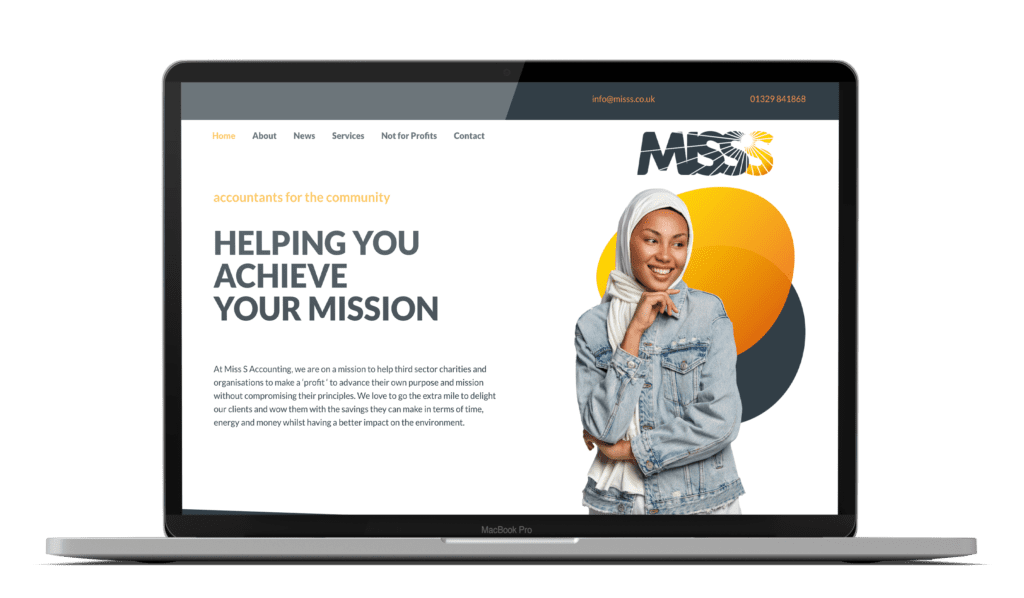
Miss S Accounting for Purpose CIC approached the morph marketing team with quite a challenging brief. They wanted an accountancy web design that distinguished them from other accountancy firms and looked nothing like an accountancy website. They wanted something quirky and different – that reflected their personalities and their focus on not-for-profit organisations. They wanted something fresh and new whilst retaining their existing brand and staying within the tramlines of their style guide. They wanted to reflect the diversity of their client groups and reflect their very clear mission.
Creative
We developed an accountancy web design that was built on their sunny disposition and branding. We used the radial lines throughout along with stock imagery, gradient shapes and quirky animations. The clients were delighted to have a site that reflected their mission, their personalities and distinguished them from the more traditional sites of their industry.


